How to Choose WPC Wall Panel Colors: A 2026 Factory Guide from Necowood
Choose WPC wall panel colors in four steps: lock the design style, pick a neutral base for 70–80% of the wall area, add one accent surface, then validate physical samples under daylight and artificial light. Keep visible colors in one connected space to three; white, black, grey, gold, and silver do not count. For bathrooms and kitchens, choose light neutrals or woodgrains — they hide water marks better than glossy dark panels.
WPC wall panels — also called wood-plastic composite wall panels — are one of the fastest-growing interior cladding choices for residential and commercial projects. They install faster than traditional wood, resist moisture, and can be produced in hundreds of colors and woodgrain finishes.
But the single most common question buyers ask before placing an order is still: “Which color should I choose?”
At Necowood, we manufacture WPC wall panels daily and ship them to contractors, designers, distributors, and hotel projects worldwide. This guide is our factory-level answer: a practical, room-by-room color selection system you can apply immediately.
Why WPC Wall Panel Color Matters More Than You Think
A wall panel system can cover 30%–60% of the visible surface in a room. That means the color you choose controls the base tone, brightness, and emotional temperature of the entire space.
Color affects three things at once:
- Perceived space — light colors recede and make a room feel larger; dark colors advance and create depth.
- Mood — blue and green calm the nervous system; red and orange stimulate energy; neutral tones create balance.
- Material perception — the same panel can look warm, industrial, luxurious, or minimal depending on its surface finish and color.
A coordinated color plan at the start of a renovation saves time, money, and rework. It also prevents the most expensive mistake in interior cladding: ordering a color that looks perfect on a screen but wrong in the actual room.
The Necowood 7-Step WPC Color Framework
1. Define the design style first
Match the panel color to the room’s style before you fall in love with a color. Modern minimalist interiors work well with neutral tones, deep charcoal, and concrete-look finishes. Nordic and Scandinavian spaces suit warm white, light grey, and pale oak. Industrial lofts can carry dark walnut, black, and raw concrete textures. Luxury hospitality projects often use deep brown, navy, or custom brand colors with metallic accents.
2. Map the lighting before choosing the color
The same WPC color will look different under different lighting conditions. A north-facing room with cool daylight makes warm whites look grey. A south-facing room with strong sunlight makes dark colors look richer and lighter colors look washed out.
Factory tip: For rooms with limited natural light, choose warm neutrals — ivory, cream, warm greige, light oak. For bright, sun-filled rooms, you can use deeper greys, walnut, charcoal, or forest green without making the space feel dark.
3. Choose a neutral base for 70–80% of the wall area
White, greige, cream, light grey, and light oak are the safest WPC colors for large surfaces. They do not count toward the three-color rule, they coordinate with almost any furniture, and they remain fashionable for years. Use them on main walls, corridors, ceilings, and built-in cabinets.
4. Add one accent surface, not five
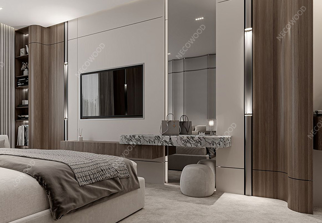
The fastest way to make a room look designed is to use one accent wall. A woodgrain WPC panel behind a TV, a charcoal panel behind a bed, or a deep green panel in a reception area creates focus without overwhelming the space. Keep the remaining walls quiet.
5. Apply color psychology deliberately
Use calming blues, greens, and warm neutrals in bedrooms and wellness spaces. Use warm creams and woodgrains in living and dining areas. Use deeper, more saturated colors in offices, studios, and commercial branding zones where focus and authority matter.
6. Use the color wheel to build a palette
- Analogous: cream + oat + light oak — soft, cohesive, and safe.
- Complementary: navy + warm brass + walnut — strong contrast for feature walls.
- Triadic: green + terracotta + sand — energetic, ideal for kids’ rooms and creative studios.
7. Validate physical samples on site
Never finalize a WPC color from a phone screen. Request physical samples, place them on different walls, and view them at three times: morning daylight, late afternoon, and night with artificial lights on. This single step prevents most color regrets.
Room-by-Room WPC Wall Panel Color Guide
Use these mobile-friendly cards as a starting point for residential and hospitality projects.
Living Room
Recommended: Cream, ivory, light oak, greige + one charcoal or walnut accent wall.
Avoid: Large areas of high-saturation red or orange.
Why: Warm neutrals are timeless and easy to pair with sofas and media walls.
Master Bedroom
Recommended: Warm white, blush, soft blue, sage, light woodgrain.
Avoid: Glossy black, neon brights.
Why: Soft colors support relaxation and sleep.
Kids’ Room
Recommended: Light blue, mint, cream, pale pink + one playful accent.
Avoid: Heavy dark panels on all walls.
Why: Bright, cheerful tones support a healthy visual environment.
Home Office / Study
Recommended: Deep grey, forest green, navy, walnut.
Avoid: Large pure-white walls under strong light.
Why: Darker tones reduce glare and improve focus.
Bathroom
Recommended: White, light grey, light oak, teal.
Avoid: Glossy pure black in wet zones.
Why: WPC is waterproof and mold-resistant; light tones brighten small spaces.
Kitchen / Dining
Recommended: Warm white, cream, oak, sand.
Avoid: Cold blue-grey as the dominant tone.
Why: Warm palettes create a more inviting dining atmosphere.
Hotel / Commercial
Recommended: Deep brown, charcoal, champagne gold, custom brand color.
Avoid: Random multi-color mixing without a system.
Why: Communicates quality, consistency, and brand identity.
Basement / Media Room
Recommended: Charcoal, slate, dark walnut, deep green.
Avoid: Bright white on every wall.
Why: Dark tones absorb light and improve cinema-like atmosphere.
Half-height WPC panels for small spaces
In bathrooms, powder rooms, and bedrooms, half-height WPC wall panels are a practical alternative to full-wall cladding. They pair beautifully with wallpaper, paint, or tile. Because WPC is waterproof and easy to clean, it works especially well in small bathrooms where moisture and maintenance are concerns.
Floor-to-ceiling panels for a taller, wider look
Running WPC panels from floor to ceiling in a single color creates a strong vertical line and makes a room feel taller. This works well in corridors, hotel rooms, lobbies, and compact apartments. Keep the furniture and artwork as the color accents.
Popular WPC Finishes and Custom Colors
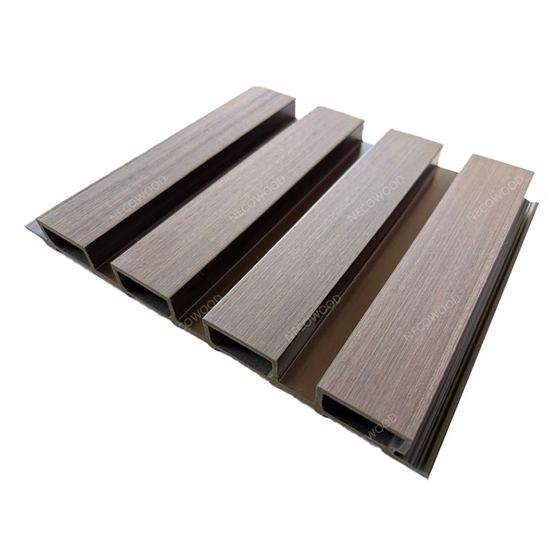
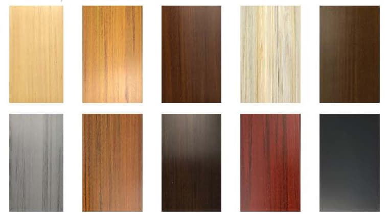
Necowood produces WPC wall panels with wood powder and thermoplastic polymer. The result looks like real wood, installs faster, and performs better in humid environments. Surface finish is just as important as color.
Woodgrain Series
Oak, walnut, teak, ash, and hundreds of embossed wood textures. Ideal for living rooms, bedrooms, and hospitality projects.
Solid Matte Series
Warm white, cream, greige, charcoal, forest green, navy. Best for large surfaces and modern minimalist interiors.
Stone & Concrete Series
Slate, cement, travertine, and micro-cement looks for industrial, retail, and commercial spaces.
Metallic & Specialty Series
Brushed gold, champagne, copper, and custom metallic effects for luxury hotels and branded environments.
Custom Pantone / RAL Matching
Send us a color chip or brand guideline. We match it, produce a sample, and scale to bulk production.
Profile Customization
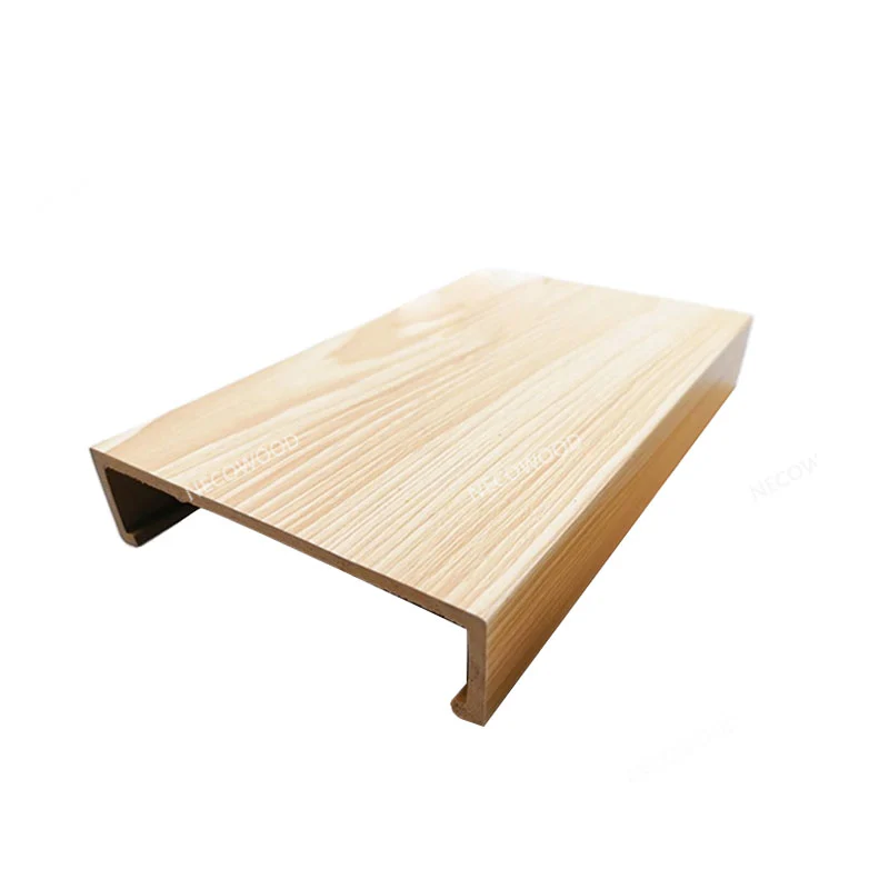
Panel width, thickness, groove shape, click-lock system, and corner trims can all be customized.
12 Application Scenarios for WPC Wall Panels
WPC wall panels are used across residential, hospitality, retail, and semi-outdoor projects. Each scenario below includes the recommended color direction, the performance reason, a practical installation note, and a placeholder image you can swap for your real project photo.
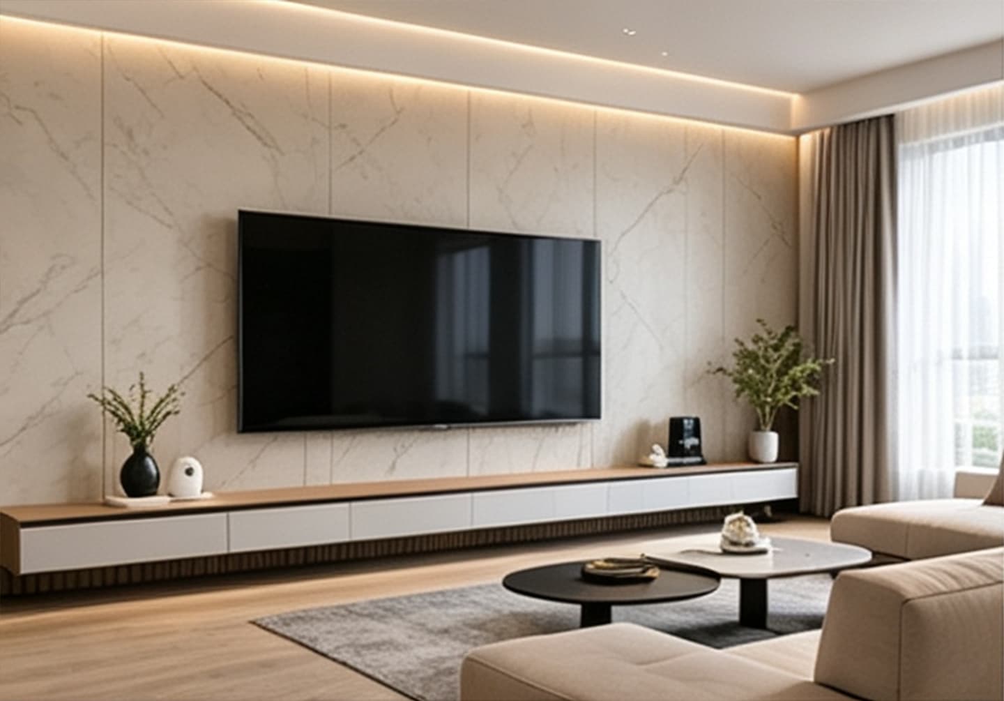 01 · Residential
Living Room Feature Wall
Color direction: Woodgrain (oak, walnut) or charcoal on a single wall; keep the other walls cream or greige.
Why WPC: Adds warmth and texture without the cost and maintenance of solid wood. Easy to wipe clean around TV units and media consoles.
Recommended profile: 150–300 mm fluted or flat panel
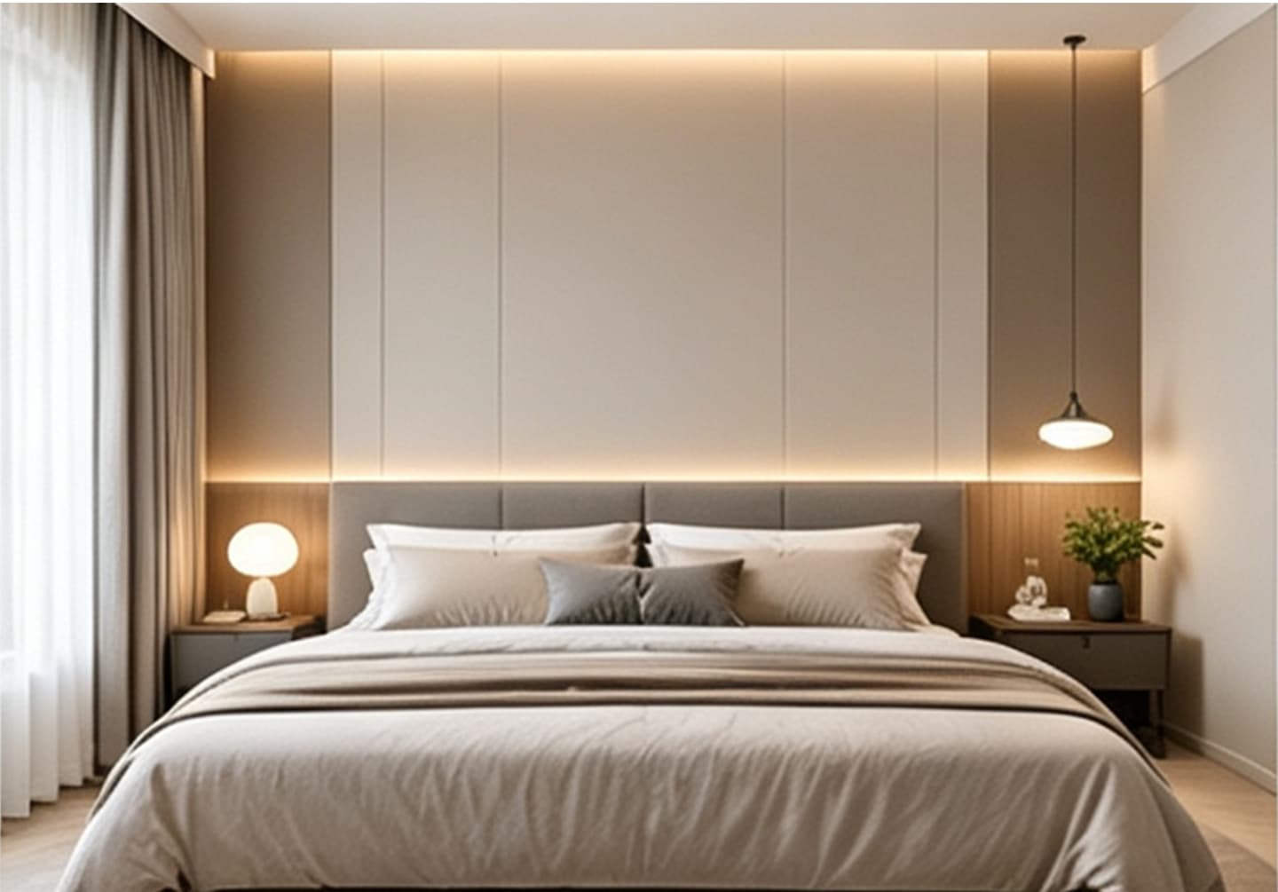 02 · Residential
Master Bedroom Headboard Wall
Color direction: Soft neutral, light oak, warm white, or muted sage for a calm sleep environment.
Why WPC: Moisture-resistant and dimensionally stable — no warping behind the bed in humid climates. Softer to the touch than tile or concrete.
Recommended profile: flat panel or low-relief woodgrain
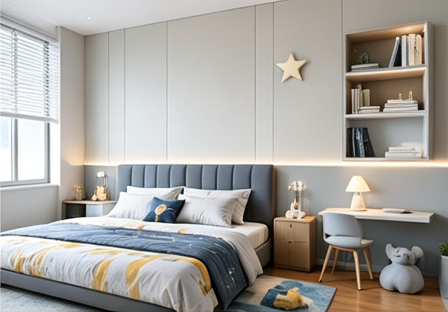 03 · Residential
Kids’ Room Accent Wall
Color direction: Light blue, mint, cream, or pale pink with one playful accent panel.
Why WPC: Wipeable surface handles crayon, fingerprints, and spills far better than wallpaper or painted drywall.
Recommended profile: flat panel with rounded corner trim
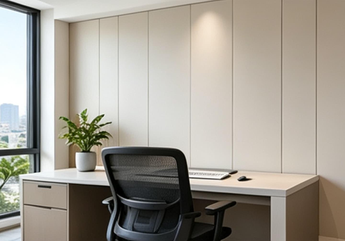 04 · Residential
Home Office & Video-Call Background
Color direction: Deep green, navy, walnut, or charcoal — darker tones reduce screen glare and look professional on camera.
Why WPC: Dense panel surface improves acoustic comfort and reduces echo in small rooms.
Recommended profile: fluted panel for acoustic diffusion
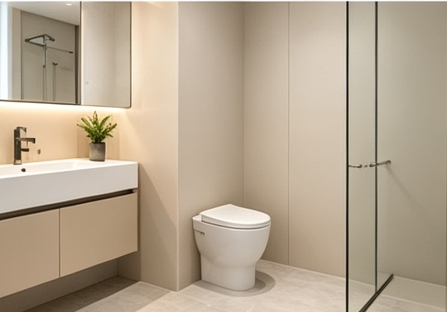 05 · Wet Area
Bathroom Half-Height Cladding
Color direction: White, light grey, light oak, or teal. Avoid glossy black in direct wet zones.
Why WPC: 100% waterproof, mold-resistant, and termite-proof. Replaces tile for a warmer, faster-install finish.
Recommended profile: flat panel with matching end caps
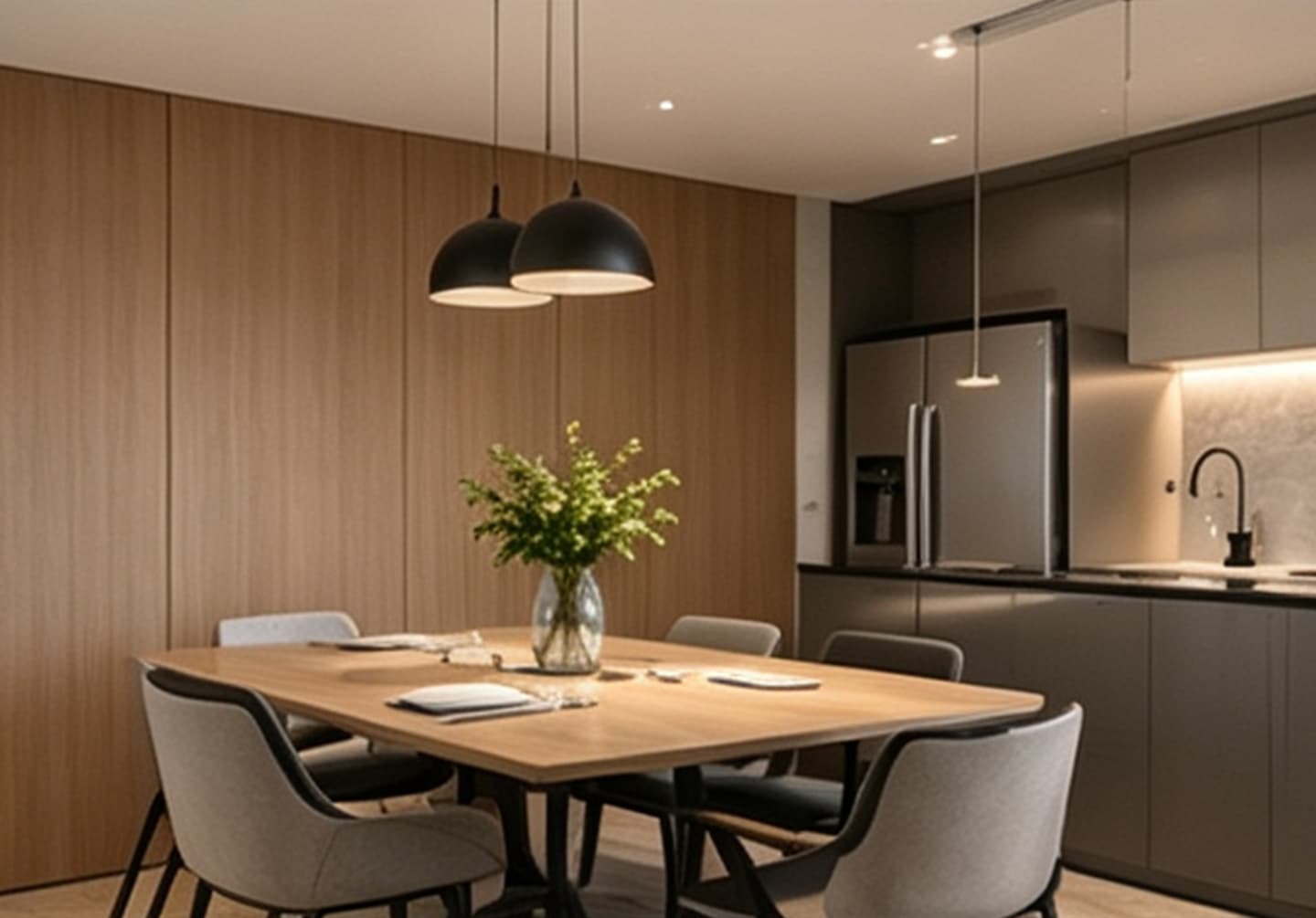 06 · Wet Area
Kitchen & Dining Wall
Color direction: Warm white, cream, oak, or sand. Avoid cold blue-grey as the dominant tone.
Why WPC: Grease and moisture wipe off easily. No grout lines to scrub, unlike tile backsplashes.
Recommended profile: flat panel with heat-resistant backing
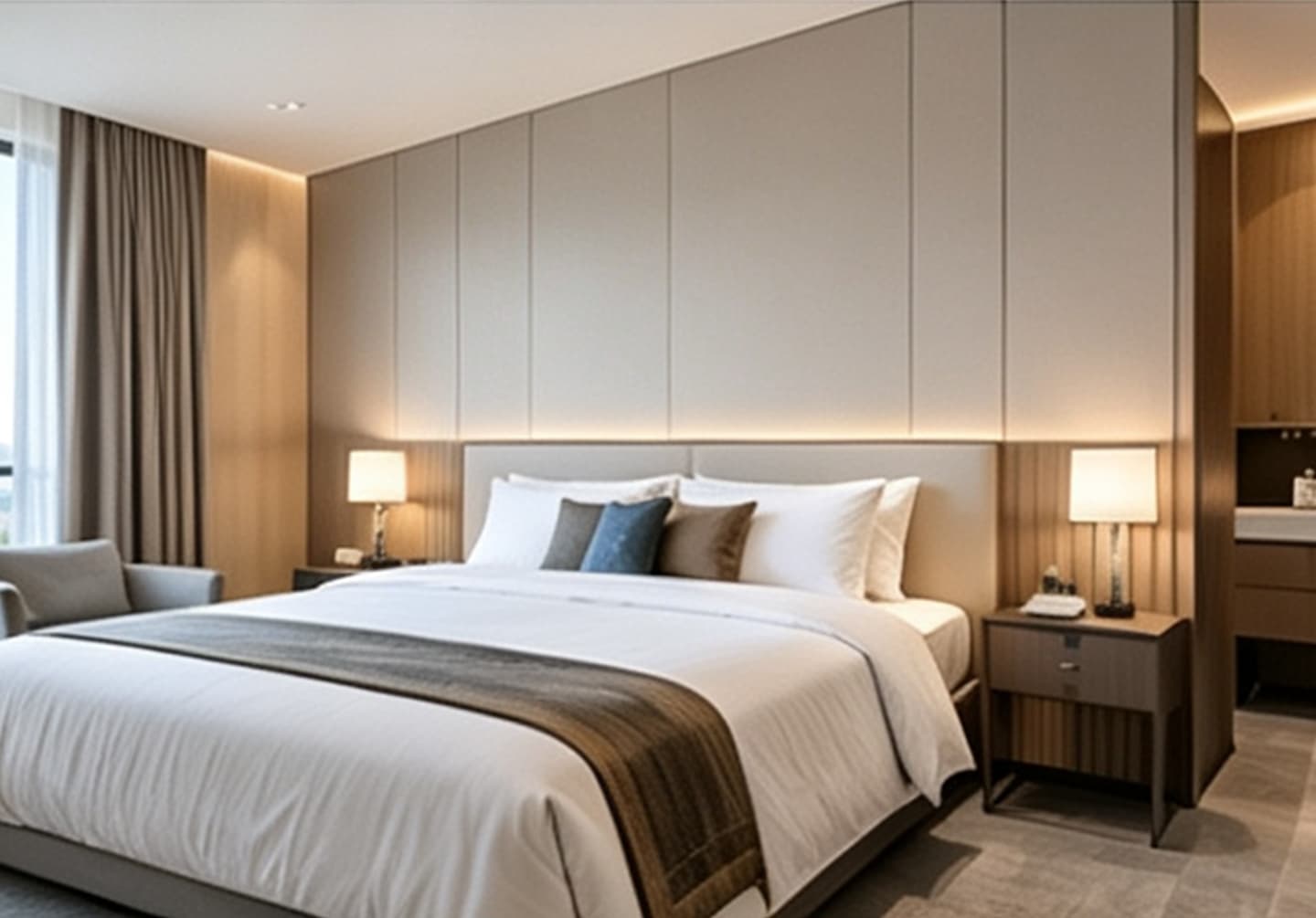 07 · Residential
Basement & Media Room
Color direction: Charcoal, slate, dark walnut, or deep green — dark tones absorb light for a cinema feel.
Why WPC: Handles below-grade humidity without swelling, cracking, or peeling like MDF or drywall.
Recommended profile: wide flat panel or acoustic slat
Hotel Guest Rooms
Color direction: Brand-consistent deep brown, charcoal, or warm neutral across all rooms.
Why WPC: Durable, easy to clean between guests, and resists dents better than painted drywall. Fast installation keeps room downtime short during renovation.
Recommended profile: floor-to-ceiling flat panel
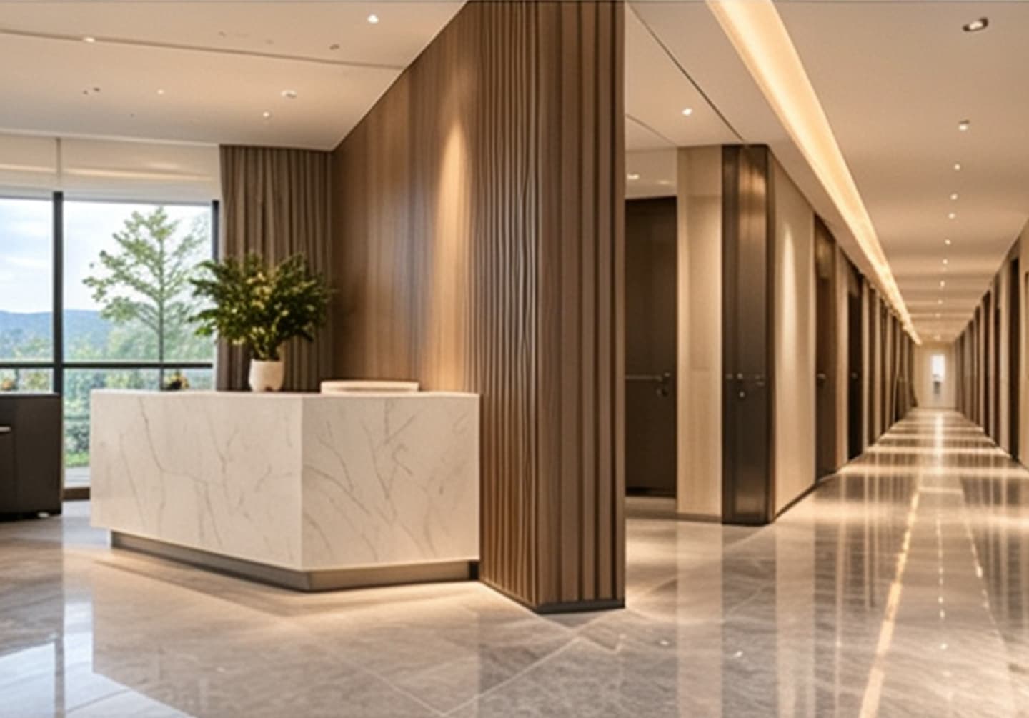 09 · Hospitality
Hotel Corridors & Lobbies
Color direction: Neutral base with a dark accent band or woodgrain corridor walls.
Why WPC: Withstands luggage trolley impact and high foot traffic. Uniform color across long walls creates a premium, continuous look.
Recommended profile: wide panel with impact-resistant surface
 10 · Commercial
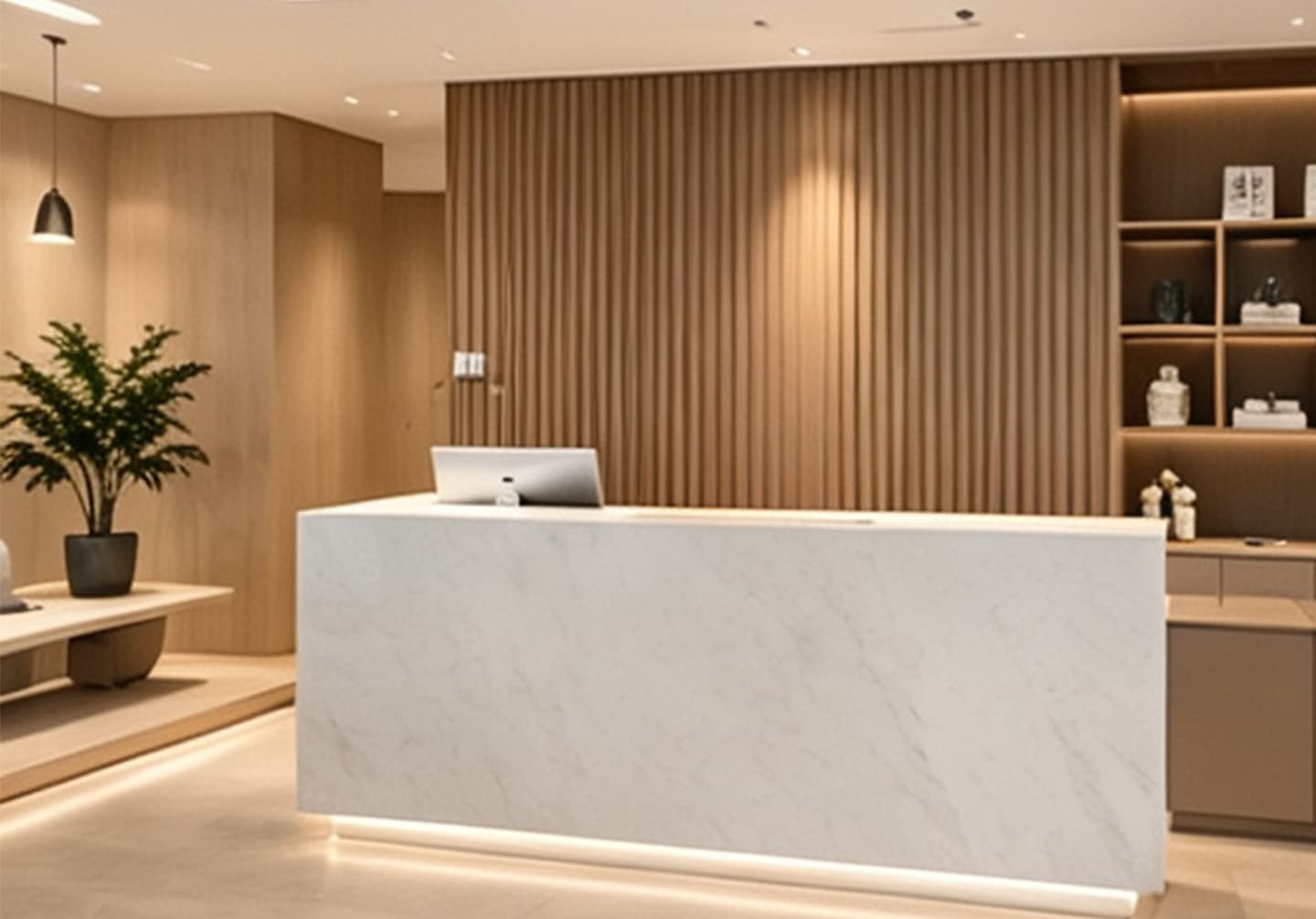
Retail Reception & Showroom
Color direction: Custom Pantone brand color, metallic finish, or stone-look panel.
Why WPC: OEM color matching keeps every franchise or showroom consistent. Panels can be branded, curved, and cut to custom shapes.
Recommended profile: custom color + logo engraving
 11 · Commercial
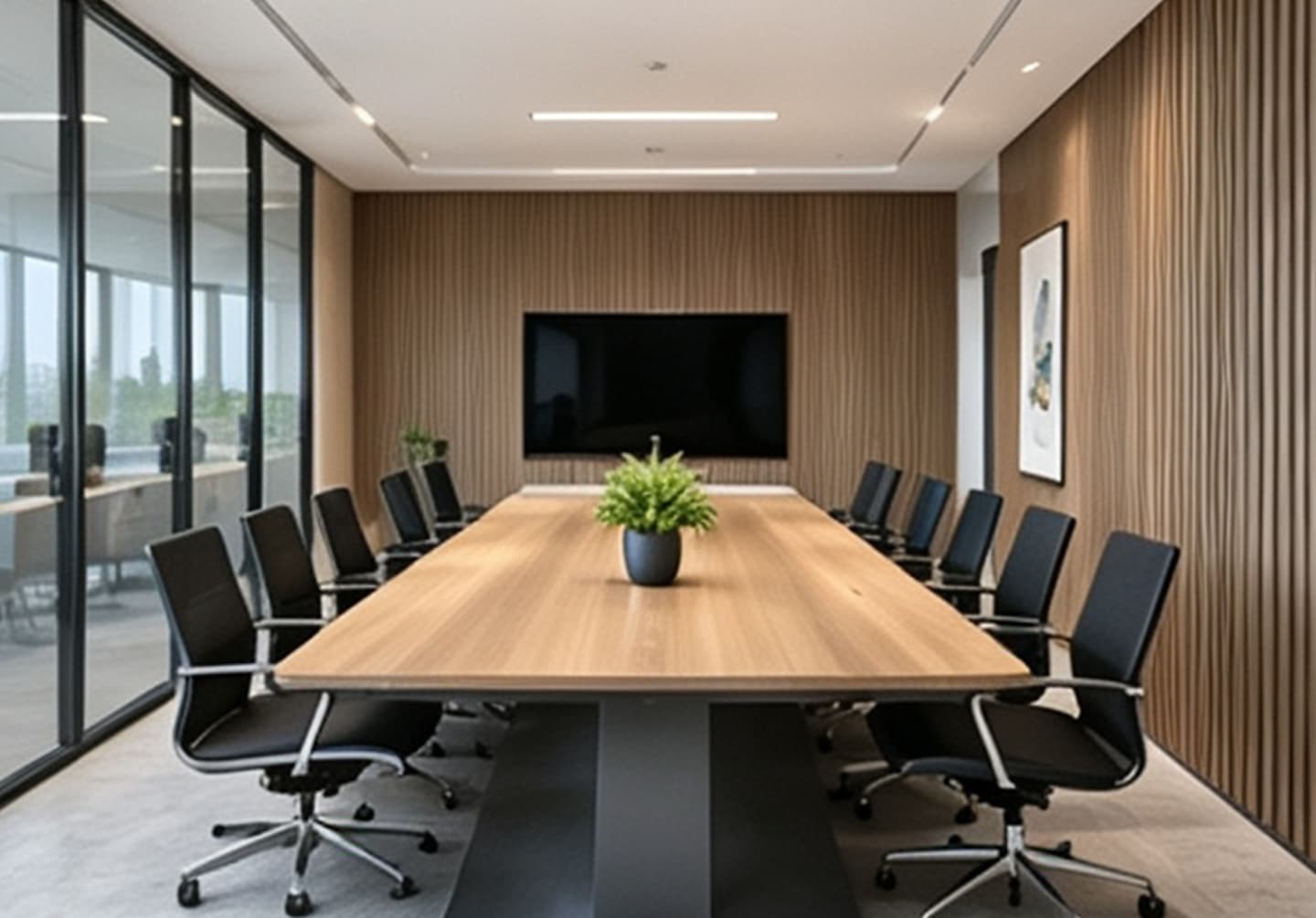
Office Meeting Rooms & Partitions
Color direction: Deep grey, navy, or woodgrain to match corporate identity.
Why WPC: Can be combined with acoustic backing to reduce echo. Panels double as writeable or magnetic surfaces with the right overlay.
Recommended profile: fluted or perforated acoustic panel
 12 · Semi-Outdoor
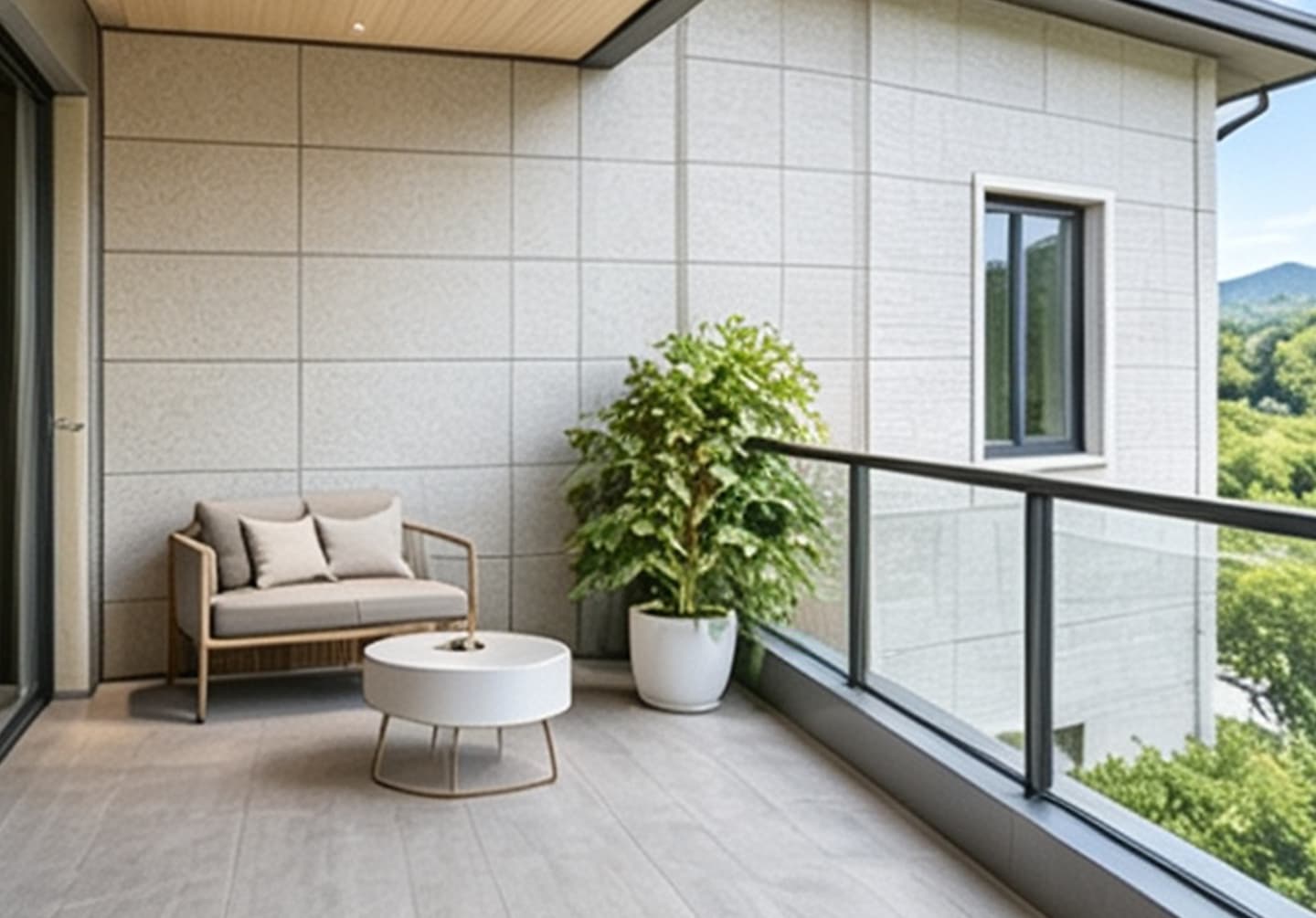
Covered Balcony & Prefab Home Walls
Color direction: Light oak, grey, or warm neutral with UV-stable top layer.
Why WPC: UV-resistant exterior-grade WPC handles sun and humidity without fading, cracking, or rotting like natural timber.
Recommended profile: exterior-grade WPC with UV coating
How to choose the right scenario for your project
- Identify the moisture level. Dry rooms (bedroom, office) can use any WPC finish. Wet rooms (bathroom, kitchen) should use waterproof WPC with sealed edges.
- Identify the traffic level. High-traffic commercial areas benefit from impact-resistant wide panels; residential feature walls can use decorative fluted profiles.
- Identify the lighting. Dark panels absorb light and suit media rooms; light panels reflect light and suit small bathrooms.
- Identify the brand requirement. Commercial projects should request Pantone or RAL color matching from the factory before ordering.
The Three-Color Rule and Special Colors
In interior design, one simple rule prevents most color chaos: no more than three colors in one connected space. This includes ceiling, wall panels, floor, and major furniture.
- Three-color rule: Use a maximum of three visible colors per connected room. Two adjoining rooms count as one space.
- Special colors: White, black, grey, gold, and silver are excluded from the three-color count.
- Gold and silver: Do not use both metallic tones in the same space. Choose one.
- Neutrals: Use them as the base, not as an afterthought.
This rule keeps WPC wall panels from competing with furniture, curtains, and artwork. It also makes a space feel larger and more intentional.
Why Buy WPC Wall Panels from Necowood Factory
- Factory-direct pricing — no middleman markup.
- OEM / ODM color matching — Pantone, RAL, and customer samples.
- Waterproof, mold-resistant, termite-resistant — suitable for humid climates.
- Fast installation — click-lock and tongue-and-groove systems.
- Low maintenance — wipe clean with a damp cloth.
- Eco-conscious material — wood powder and recyclable polymer.
- Global shipping support — samples, technical drawings, and installation guides.
Request a Necowood WPC Color Sample Kit
See the real color, texture, and weight before you specify. OEM colors available.
Get Free SamplesFrequently Asked Questions
What is the most timeless WPC wall panel color?
Warm white, ivory, greige, cream, and light oak are the most timeless WPC wall panel colors. They work with almost any furniture, do not count toward the three-color rule, and are less likely to look dated after five years.
Are dark WPC wall panels suitable for small rooms?
Yes, if dark panels are used on a single feature wall rather than all four walls. Keep the ceiling and adjacent walls light to create depth. Dark WPC panels can make a small room feel more elegant and expansive when contrasted with lighter surfaces.
Can Necowood custom match a WPC wall panel color?
Yes. Necowood offers OEM and ODM color matching for Pantone, RAL, and customer-provided samples. We can also customize woodgrain embossing, stone texture, metallic finishes, panel width, thickness, groove profile, and click-lock systems.
Are WPC wall panels waterproof and mold-resistant?
Yes. WPC wall panels are made from wood powder and thermoplastic polymer, so they do not absorb water, swell, or support mold growth. They are suitable for bathrooms, kitchens, basements, and other humid areas.
Do WPC wall panels fade in sunlight?
Quality WPC panels use UV-stabilized pigments and co-extruded surface layers to resist fading. For indoor use, color stability is typically excellent. For covered outdoor or balcony use, choose a UV-resistant exterior-grade WPC panel.
What is the MOQ and lead time for custom WPC wall panels?
MOQ depends on the color, surface finish, and panel profile. Sampling usually takes 7–10 days. Bulk production is typically 15–25 days after sample approval. Contact Necowood for an exact quote.
Final Thoughts
WPC wall panel color is not just a decorative decision. It shapes how a room feels, how large it appears, and how well it ages. Start with a neutral base, add one accent, test real samples under real lighting, and keep the total palette to three colors per connected space.
Whether you need warm neutrals, deep woodgrains, or a fully custom Pantone match, Necowood’s factory team can produce the color, texture, and profile your project requires.
Contact Necowood today to request a WPC wall panel color sample kit.